What features does my designer profile have?
We’ve developed your profile page to effectively showcase your best work and introduce you to clients.
To optimize your profile page, you should familiarize yourself with the 9 important features listed below:
- Profile cover image
- Your Avatar
- Private messaging button
- "Invite to Work" button
- Your portfolio
- Expanded view for your individual designs
- Category filters
- About page
- Services (Top Level only)
1. Profile cover image
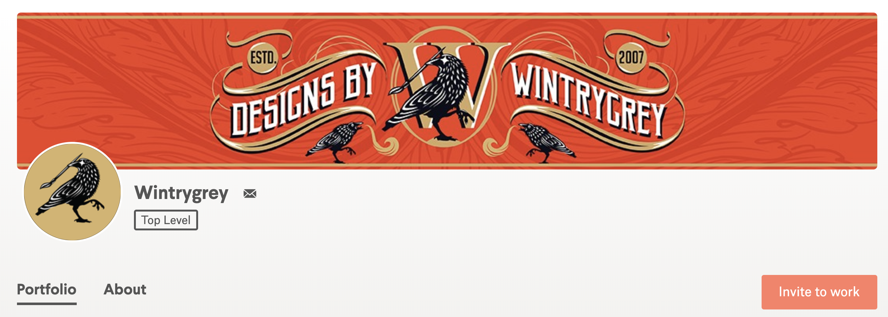 Wintrygrey's cover image shows their personality and style.
Your profile cover image is one of the first things clients will see, so it's important that it showcases your personal style.
For best results, use the following dimensions:
- Suggested size: 2480 x 400 px (for retina displays)
- Minimum size: 1240 x 200 px
- Display size: 1240 x 200 px on desktop screens; 540 x 200 px on mobile devices (minimum)
Profile cover design tips
Keep text simple and legible. Less is always better! Your name and tagline are great, but personal contact information is not allowed anywhere on your designer profile, including your cover image. Not only is it a security risk, but it also conflicts with the "Invite to work" button that drops you and your client directly into the 1-to-1 Projects workflow. See this article for more info on this policy →
Show off your personality and style, but make sure it doesn’t distract from the rest of your portfolio or clash with your avatar. Never use images or designs that don’t belong to you. It's misleading and will only damage your credibility.
2. Your avatar
Your avatar puts a face to your brand and gives potential clients a peek at who they could be working with.
For best results, use the following dimensions:
- Required avatar size: 500 x 500px square
- Minimum Display Size: 32 x 32px
- Format: Your avatar will be displayed as a circle
Tips for professional headshots
![]() These designers chose to use a professional headshot for their avatar.
These designers chose to use a professional headshot for their avatar.
Take your photo under natural light. You can have the worst camera in the world and still take a stunning photo outside, especially during the golden hour before sunset.
Show off your personality. Professional doesn't have to mean boring. Give the client a better sense of who you are by incorporating an interesting background. A white background gives photos a clean, minimal feel while a colorful background can add an extra pop.
Avoid too many filters. While filters can be fun, they often look less crisp and can quickly become dated.
Tips for creating a branded avatar
If you’re not a fan of putting up your photo for everyone to see, consider using your avatar as an extension of your brand.
Play off your cover photo. Consider the brandmark you choose carefully. You should put as much thought into this one as you would with a client.
Keep the image simple. Your avatar appears in different sizes across the site and should shrink down without losing too much detail.
3. Private messaging button
The small envelope icon next to your user name is where customers can send you a private message.
4. "Invite to work" button
This enables clients to quickly and easily start a 1-to-1 project with you.
5. Your portfolio
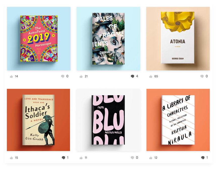 hortasar carefully curates his portfolio, showcasing cohesive designs that highlight his specialty (book covers!).
You can add designs from Contests you've entered (excluding private contests) and designs approved by clients in 1-to-1 Projects to your portfolio page.
Tips for an attractive design portfolio
Utilize your artistic sensibilities by selecting works that display a diverse array of skills and styles. A portfolio isn’t a dumping ground for your latest work, but rather another project that requires skillful design.
Be consistent. Make sure everything’s the same size. For mockups or packaging, use similar lighting, drop shadows and backgrounds. Consider using a cohesive color palette.
Group similar styles together.
Showcase your range. If you have versatile skills or styles, your portfolio is a great place to put a spotlight on them. Filters help clients zero in on different design categories and your most recent or popular designs.
Crop! For more intricate projects, try zooming in on a specific detail to grab the viewer’s attention. This is your chance to highlight an aspect of your design that’s exceptionally well done. The viewer can then click to view the masterpiece at a larger scale.
6. Expanded view for your individual designs
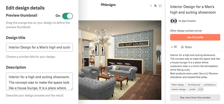 Eye Creation does a great job with title, description and tags on this design.
When you add a design to your portfolio, you'll be prompted to provide a host of information — be sure to fill in all the necessary details so your designs will be easily searchable!
Expanded view features include:
Title: Take a moment to give your design a proper name. It shows both pride in your work and professionalism. This small amount of effort can go a long way.
Description: Put some thought into explaining your concept for the design. A brief explanation allows for a much higher understanding and appreciation of your work.
Comments from other community members.
Customizable Thumbnails: Use the cropping tool to create visually appealing thumbnail
Tags: Tagging is one of the most essential aspects of 99designs’ designer portfolio and will help you and your work become more discoverable to clients. Think about what clients are searching for and how your work can best match their needs. There’s a maximum tag amount, so be sure to be thoughtful with the ones you use.
7. Category filter
Clients can browse your work by category. The feature appears on the top left of your Portfolio page after you've added designs from two categories or more.
8. About page
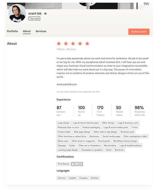
Svart ink matches strong stats with a great bio.
Your About page gives clients information about you, your skills and your professional experience:
Bio: You can include special training, interests, availability, etc. This is the place to tell people more about yourself and your experience. You may not include your personal contact information such as email address, phone number, Skype, etc. Designers who include personal contact info in their profiles will have their accounts suspended. See this article for more info →
Languages
Experience: This section will be automatically populated based on your Contest and Project history.
Certifications: This section includes any certifications you have earned on 99designs.
Client testimonials: After you win a Contest or complete a 1-to-1 Project, we prompt clients to leave a testimonial. Being a professional designer is not just about creating amazing work... it's also about providing great customer support.
9. Services (Top Level designers only)
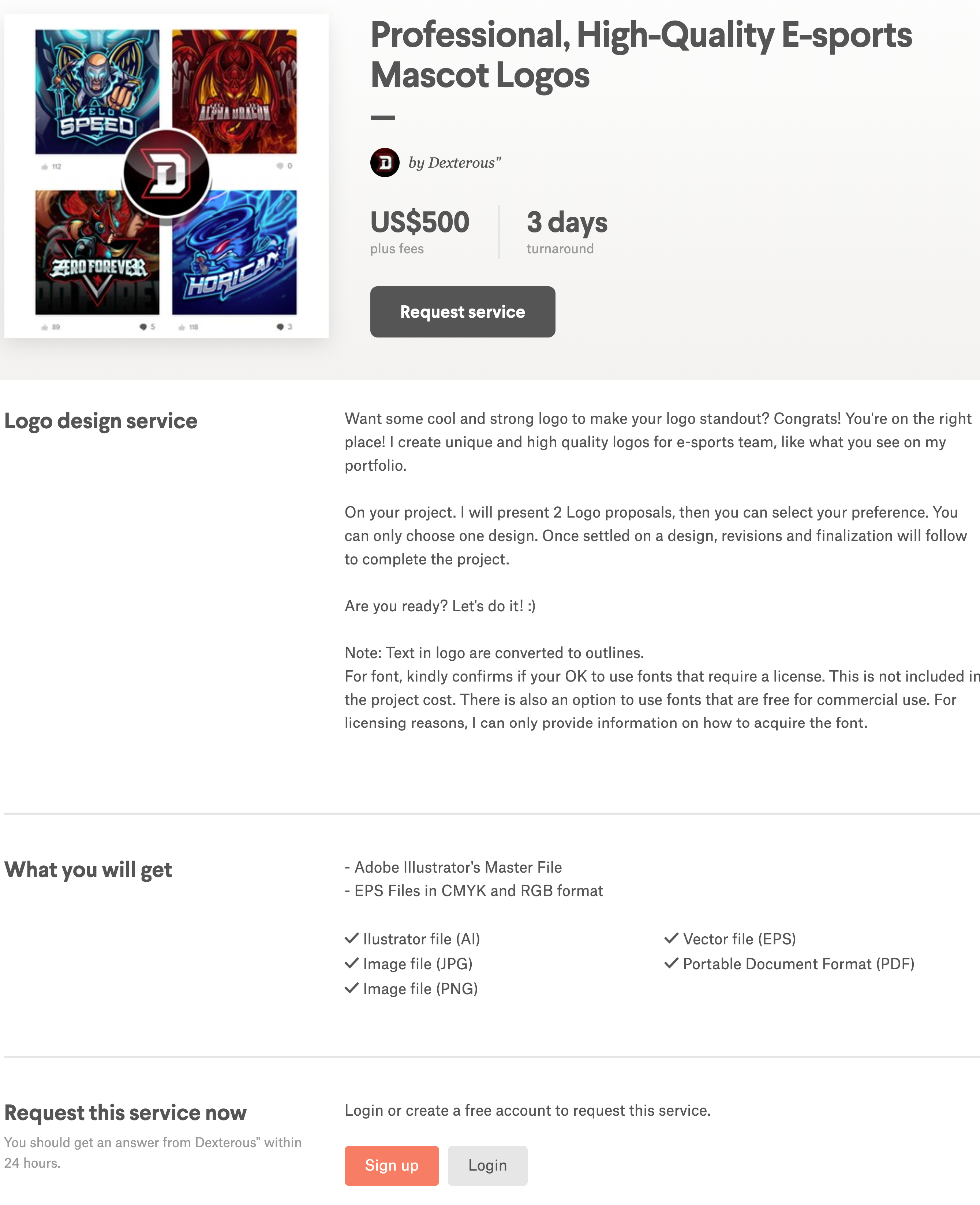 Dexterous" and other Top Level designers enjoy the perk of selling their services in priced-out bundles.
As an added perk, when a designer is elevated to Top Level status, they will also be able to unlock a “Services” tab.
Services allow Top Level designers to set their own terms by offering up to five custom design services on their profile page. The services include pricing information, turnaround time and details on what the service includes, making it easy to initiate 1-to-1 Projects with clients.
Clients will be able to see your Service offerings when they invite you to work, after they leave you a review and in the Services tab on your profile.
Comments
Post a Comment